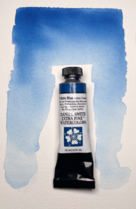
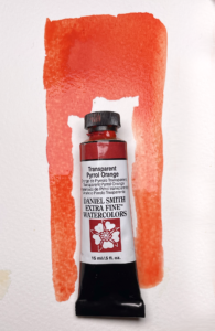
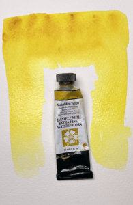
We will start with three colors:
Yellow Orchre, Phthalo Blue, and Transparent Pyrrol Orange.
We start with this limited Primary palette due to thier warm hues and tranparent attributes, we will talk more about transparency later especially when we get into glazing, but for now, just know that high quality transparent colors help us get deep rich layered paintings. We will introduce Nickel Azo Yellow in later session with landscapes.
 Yellow Orchre –
A rich golden earth tone with transparent properties. This color is great for glazing a dusty warm atmosphere.
 Phthalo Blue (Green Shade) –
A strong transparent slightly warm blue (green shade) one of my favorites for skies.
 Transparent Pyrrol Orange –
A darker red-leaning orange. great for earth colors and a supurb glazing color to warm up and unify a painting.
 Nickel Azo Yellow (for later sessions) –
A warm yellow leaning toward gold. Great for mixing greens with Pthalo Blue.
 |
Deeper dive: Why a “limited palette”?The thinking behind a limited palette is so our paintings have a more cohesive feel with our color. By mixing colors from our limited palette, easier color harmony is achieved. |
